Self-Forgivness

The following passage by E.H. Gombrich was a revelation to me, maybe an epiphany. I had been looking for a way to break out of my old habits when I found this. It became the central idea of a “Self-forgiveness Theory.” It says to keep trying, modifying, and correcting -- that the eraser is the tool of more expressive realism. In almost mystical terms: trying to create perfection is impossible, but forgiving yourself and your drawings for being imperfect and constantly refining your vision is possible.


“Seen in this light, that dry psychological formula of schema and correction can tell us a good deal, not only about the essential unity between medieval and post-medieval art, but also of their vital difference. To the Middle Ages, the schema is the image, to the post-medieval artist, it is the starting point for corrections, adjustments, adaptations, the means to probe reality and to wrestle with the particular. The hallmark of the medieval artist is the firm line that testifies to the mastery of his craft. That of the post-medieval artist is not facility, which he avoids, but constant alertness. Its symptom is the sketch, or rather the many sketches which precede the finished work and, for all the skill of hand and eye of the master, a constant readiness to learn, to make and match and remake till the portrayal ceases to be a second hand formula and reflects the unique and unrepeatable experience the artist wishes to seize and hold.”


Art & Illusion: A study in Psychology of Pictorial Representation, Page 173

-- E. H. Gombrich


Thursday, January 17, 2013

Quick WC Swamp -- almost completed

I have almost finished this piece. Time to go home but no reflective time. I think a tree or two might be needed and although no one else will notice, I want to add some variety of color to the tree trunks. I had used a few different colors, but they have dried rather flat. Now, I need to use some dark tone gouache and staining colors.


Wednesday, January 16, 2013

An Easy Correction

After a nights sleep I came back and looked at the last project. When I looked at the highlights on the tree trunks, they felt a little stiff and applied. With a small flat brush, I gently scrubbed the right side of the highlights. Next I applied a very light wash over them. Finally, I put a small highlight line over the older muted one. Is it really finished? I hope, but I will stay open to change; however, I hope I remember to honor the intent of its beginning -- quick painting.

Swamp Exhibit heading to Elizabeth City, NC

SWAMPS AND OTHER WETLANDS will be at The Arts of the Albemarle Gallery in Elizabeth City, NC during the month of February. The opening reception will be from 5:30 to 7:00 on Friday, February 1, 2013. I hope you can make it. I would love to see you.

Tuesday, January 15, 2013

Quick Watercolor Swamps


After drawing in the major elements, waterline and some of the major foreground trees, I added  a light blue wash (cobalt and cerulean). Next I deepened that solution with some ultramarine and added the darker water shapes. While the paper was damp, I dropped in the purples, ochers, and  orange/rust tones. With a brush damped with more paste-like green colors, I added the foreground. At this stage I was careful to make sure the paper was damp.  The next thing was to speckle with some random thrown paint.

 The trees were then added, back to front. Lighter and more delicate strokes to the back and darker and wider trees coming forward.  As I brushed the trunk, I had another bush loaded with another color, ready to drop that into the wet strokes. This gave the trunks some subtle variety. Finally with a light shade of gouache. I cast the light on the left side of the trees.


This is another swamp, but painted in almost the same way.

Sunday, January 13, 2013


Quick Watercolor of Swamp


Here is the drawing and some of the first thoughts. I started with a light wash across the sky and a darker wash over the land (water). Instead of starting with the lights on the trees, I thought I would block in the shadows. I like the dance of shapes and marks that I have created.


Worked a little more on the trees and then went to the ground, breaking up the shapes with shadows and tonal variations.

Once I started to put the green washes onto the trees, I realized the painting was losing much of playful character of the underpainting, so I reinforced the shadows with much darker shades. I tried to drop warmer tones into the dark shadows to add variety. Using darker tones, I also tried to separate the layers of the trees. Something was still needed, so I added some lights in gouache. 


Wednesday, June 1, 2011

Saturday, May 28, 2011

Watercolor Demonstration: Using Arbitrary Color and Layers


This demonstration was done for the Peninsula Watermedia Society (Charles Taylor Arts Center, Hampton, VA). I think this is a great instructional demonstration about the strength of value (light, medium and dark) compositions and the possibilities of using layers to create values -- including the halftones for the major values.


I had a photo of this young calf, the drawing of the calf is fairly accurate -- the background is made up, because I didn't like what was in the photo.


Step 1: I put a wash across the whole page. If I had wanted to leave any white space, this would have be the time to do that. I made the wash with three colors; aureolin, rose madder, and cobalt blue -- all three weak, non-staining transparent colors. Notice that the paint is applied without regard to the drawing.


Step 2: Using the same colors (and the same concentration of color) I start defining the shadows in the light section of the cow.


Step 3: I apply another coat (layer) of the same paint-solution to the shadows. Notice that by layering another layer, the section gets darker. Transparent watercolor paints will darken as you layer them, until they reach the saturated body-color.


Step 4: I mix a richer, darker version of the same paints and randomly apply it to the background. Notice how the cow shape is now light by comparison.


Step 5: Making even richer colors, I try to break the horizontal and vertical elements apart. Notice the the path is lighter that the weeds.


Step 6: Although I am not satisfied with background, I paint in the some of the darks of the animal. This is done because of the time restraints of the demonstration. I use my staining colors: thalo green, thalo blue and alizarin crimson. They are strong, dark, transparent colors.


Step 7: A session at home and with a different focus. For some reason (to darken the background) I put a wash across the entire background. This makes it a little muddy. I darken some of the shapes on the cow, also.


Step 8: I finish of the spots on the cow. Break out the gouache and make some corrections. Notably the ridge on the cow's back and texture marks on the ground and weeds. The opaque marks make the muddy colors look more transparent. Not my favorite painting, but I do think we have located a shape in space, made the illusion of form and . . .

Thursday, August 26, 2010


Working with the "Make It Work" Pile of Watercolors:

For a variety of reasons, paintings don't get finished and when that happens, I put them in a pile and move on to next painting or project. At some point I get back to working and re-working them. Many of these paintings loose their freshness during this process, but I am a firm believer that you can work through the grim periods and come back with a spontaneous and rich painting.


This is the new and improved (above) and an earlier phase (below). During an earlier revision, I had already added the upper right side trees to fill that area of sky, which as a shape was boring even though it was brightly colored. I had also recently added the moon to give the sky more interest. The slope of the hill has not changed that was just bad photography. The upper photo is more true. The big difference between the two is the ground color, lightened to create more contrast and to really establish a horizontal plane (catching more light than a vertical plane). The ditch was dominating the foreground, so I tried to minimize it -- I felt that it was an important element, just not that important. I also added more high lights and shadows to the trees. The house had a little work, but mainly it is the very light blue, instead of white, gray and brown, that helped to marry it to the rest of the painting.


Sunday, August 1, 2010

Swamps and Other Wetlands


Green Mansions, oil on canvas 6' x 4'


Green Mansions, Study, Watercolor, 10" x 14"


Yellow Phoenix, Oil on canvas, 6' x 4'


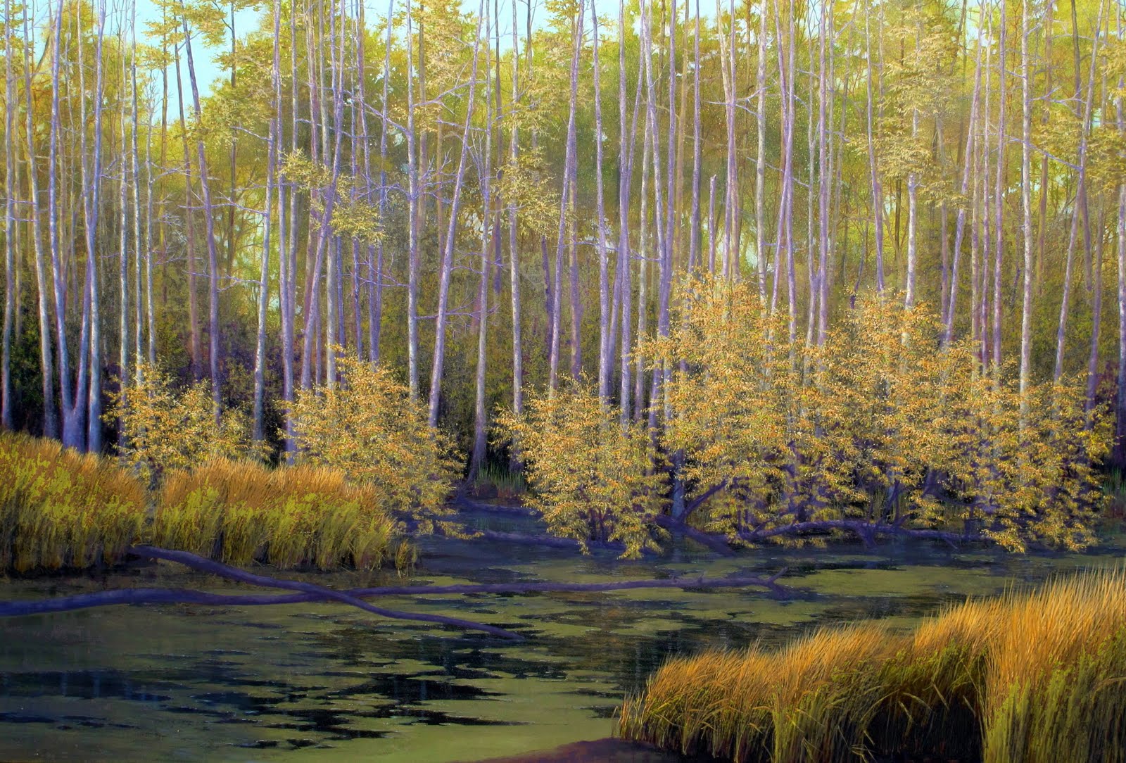
For more than two years, I have been working on a series of paintings based on swamps. These paintings are from photographs that, most often, were taken from the side of the road, but they are not photo-realistic. I rely on my years of painting experience -- from life, memory, imagination and photographs -- to enliven the paint with gestures and space. There are 58 of these paintings, oils and watercolors, displayed at the Portlock Gallery in Chesapeake, VA -- thru August 23, 2010. Yellow Phoenix is an oil painting and is 6' x 4'. This painting took me almost 6 months (working at night and weekends) to finish. The process was pretty simple. It is painted in layers in a fairly standard way, from back to front. I doubt that I will ever paint another with this much detail. Except for some of the broad background, most of this painting was painted with small and smaller brushes.

Green Mansions was much easier to paint. First there was the watercolor study -- it is always easier if you have a map, but sometimes you have to fly by the seat of your pants. Second, I was able to use a little larger brush.


Sunday, January 17, 2010

Oil Painting Process for Cows and Shade


Photo's loaded in reverse order. The underpainting is done with Terra Rosa, a soft earthy red tone that has a nice dynamic range and doesn't overpower layers that go over it. Often times the completed underpainting is satisfying as a drawing and it is hard to continue with the color layers. One easy idea about painting, in order to help control edges and spacial relationships, is to paint from back to front.